Easy CSS3 animations with Animate.css
Chapters
Key things to know about CSS3 animations
This part touch base on key things that make up a cool CSS animation.
The main component for CSS animation declaration is @keyframes,
Think of @keyframes as a point on a timeline where things change. Say you have a 1 minute long video and in that video you have many frames and each frame represents a change to what you see. @keyframes are exactly like those frames. You define a point where you would like to see objects in certain way and object are then bound to form a shape, reposition themselves as defined in your @keyframes object.
What defines a @keyframes
- You name your @keyframes. We will use subKey
- Define stages where you want to see things change. Starting stage being 0% and Ends at 100%. or if you have just 2 stages i.e. from and to, you can use a shorthand as shown below
@keyframes subKey{
 0% {
    opacity:1
 }
 100% {
   opacity: 0.5
 }
}

/*Can be rewritten as */
@keyframes subKey { from { opacity:1 } to { opacity: 0.5 } }/*can also be rewritten as if you don't want any styles starting point*/@keyframes subKey { to { opacity: 0.5 } } - Changes you want to see in terms of CSS styles.
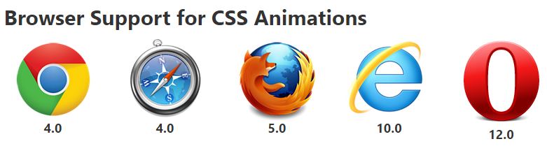
Before I go on please remember that animations we will be checking out will only be supported by browsers shown below
So Exactly how does animation work
We will use animation property to make use of @keyframes
Here are some key properties of animation property [source w3schools]
animation-name: Specifies the name of the keyframe you want to bind to the selector,@keyframesname. We usedsubKeyabove.animation-duration: Specifies how many seconds or milliseconds an animation takes to complete. the totle timeframe length, this is the duration of animation from start to the end.animation-timing-function: Specifiy speed curve of the animation ( linear | ease | ease-in | ease-out | ease-in-out | cubic-bezier ).animation-delay: Any delay you may want to impose before our animation will start.animation-iteration-count: tells browser to how many time we want this animation to be repeated.animation-direction: provides flexibity to start animation from start or reverse itanimation-fill-mode: Specifies what styles are applied by the animation once it is finished ( none | forwards | backwards | both )
Utilizing subKey
Here is a code snipped to utilize subKey keyframes
.animated {
  animation-name: subKey;
  animation-duration: 3s;
  animation-delay: 2s;
  animation-iteration-count: infinite;
  animation-timing-function: linear;
  animation-direction: alternate;
}
To simplify above we can rewrite above as
.animated { animation: subKey 3s 2s infinite linear alternate; }
Here is the official CSS Syntact from w3C animation shorthand
animation: name duration timing-function delay iteration-count direction fill-mode play-state;
We wish
We wish that would be it. But most browsers will need vendor prefixes to make things work, so till the time CSS animations comes out of working draft we would still have to use vendor prefixes as shown below
- Chrome & Safari:
-webkit- - Firefox:
-moz- - Opera:
-o- - Internet Explorer:
-ms-
So above animation definition will have to be rewritten to as shown below to get maximum browser coverage for our CSS animation
.animated {-webkit-animation: subKey 3s 2s infinite linear alternate;
-moz-animation: subKey 3s 2s infinite linear alternate;
-ms-animation: subKey 3s 2s infinite linear alternate;
-o-animation: subKey 3s 2sinfinite linear alternate;
animation: subKey 3s 2s infinite linear alternate;
}
And same applies to keyframe definitions too
@-webkit-keyframes subKey {/* stages and associated styles */}@-moz-keyframes subKey {/* stages and associated styles */}@-ms-keyframes subKey {/* stages and associated styles */}@-o-keyframes subKey {/* stages and associated styles */}@keyframes subKey {/* stages and associated styles */}
We will not be using vendor prefixes to save on space and clutter in this tutorial but you have to use them else your animation may not work on major browsers
You can also apply multiple animation to the same object separated by commas
For instance if we have 2 keyframe definitions as shown below
@keyframes subKey{
 0% {
    opacity:1
 }
 100% {
   opacity: 0.5
 }
}
@keyframes subKeyRotate {
 to {
   transform: rotate(-90deg);
 }
}.animated{ animation: subKeyRotate 2s 0s infinite linear alternate, subKey 2s 0s infinite linear alternate;}animation-timing-function: linear in everything we did above. Most of the time it produces awesome results. But you can go into checking more advanced timing functions. You can pick one that suits your needanimation-timing-function: linear|ease|ease-in|ease-out|cubic-bezier(n,n,n,n)|initial|inherit;ease | cubic-bezier(n,n,n,n) | Define your own values in the cubic-bezier function Possible values are numeric values from 0 to 1 |
Once you have those values filled in you can adjust your .animated rule as shown below
.animated{ animation: subKeyRotate 2s 0s infinite cubic-bezier(0.645, 0.045, 0.355, 1.000) alternate;}As you see that we've replaced linear setting with more advanced function to cubic-bezier
An example is shown below
Code can be found here
https://github.com/subjectcoach/subjectcoach.github.io/blob/master/css/cubic-bezier.html
Now that we know how to do stuff, we are glad to tell you that there exist a framework called animate.css which is based on CSS animations, transitions, transformations and filters.
And we will discuss that in next part.
Description
In this tutorial we will try to understand how to do CSS3 animations without much effort.
This tutorial is divided into four parts
- Key things to know about CSS3 animations
- Animations with bare minimum CSS3 code
- jQuery magic fire animation.css animation plus adding animation to element when it is visible on browser viewport
- Resources and conclusion
This tutorial will be followed by a quick quiz to check on your knowledge.
Environment
A computer with a code editor and an installed modern browser. This tutorial is not targeted at IE9 or below users/
Prerequisites
Basic understanding of HTML, jQuery and CSS.
Audience
Developers who want to learn how to apply pure CSS3 animation effects without any knowledge on this subject.
Learning Objectives
You will be introduced to CSS3 animations with keyframes
You will also use animation framework called animate.css
You will also learn how to apply CSS3 animation with help of jQuery
Author: Subject Coach
Added on: 3rd Dec 2014
You must be logged in as Student to ask a Question.
None just yet!