Plots
Chapters
Scatter Plots
Scatter Plots
'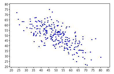
A scatter plot is a diagram in the \(xy\)-plane that consists of a collection of plotted points. The points illustrate the relationship (if there is one)
between two different sets of data, and are plotted as Cartesian coordinates.
In the example on the left, each point shows the marks of one student at Sam's school on two different tests.
Let's construct a scatter plot for an example.
Example:Soup Sales
Sam's school canteen sells soup in terms 2 and 3. The canteen manager keeps track of the numbers of bowls of soup sold and the temperature each day. She hopes to be able to use the temperature to predict how much soup she should make any a given day. Here is the data from the last three weeks of school:
| Soup Sales vs Temperature | |
|---|---|
| Temperature (\({}^\circ C\)) | Bowls of Soup Sold |
| 8 | 28 |
| 10 | 25 |
| 11 | 24 |
| 8 | 26 |
| 12 | 22 |
| 15 | 18 |
| 8 | 27 |
| 17 | 15 |
| 16 | 20 |
| 12 | 21 |
| 21 | 9 |
| 16 | 18 |
| 17 | 15 |
| 18 | 12 |
| 20 | 8 |
Here's a scatter plot of the data:
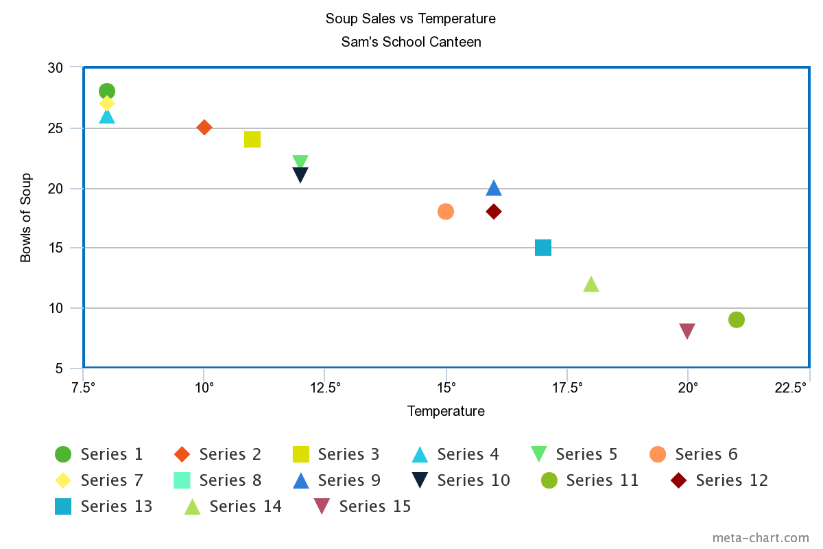
The data appear to follow a straight line fairly closely, and the slope of the line is negative. So, it looks like the canteen manager should be able to use the temperature to predict how much soup to make. The relationship is not perfect, but it is easier to see that colder weather leads to more bowls of soup being sold.
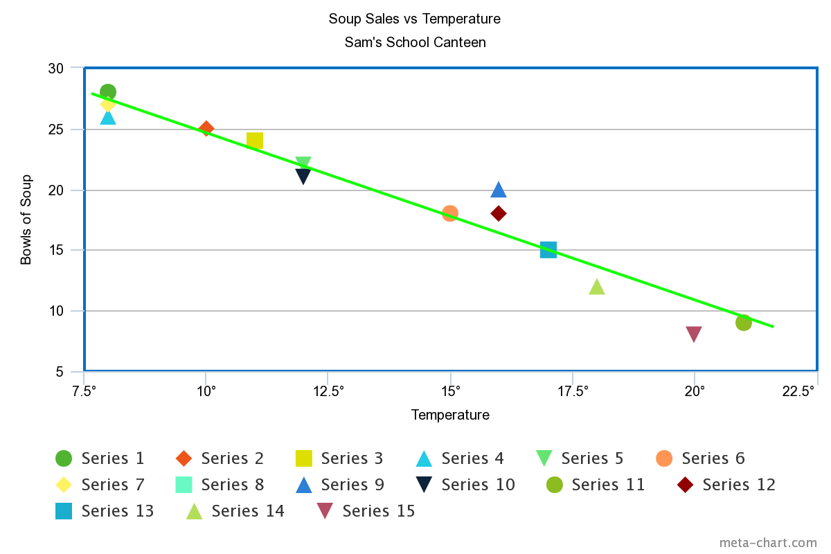
Line of Best Fit
We often draw a line of best fit (or trend line) to help us understand the relationship between the data sets plotted on our scatter plot.
We choose the line that lies as close as possible to all of the points, and for which approximately the same numbers of points lie above and below the line.
Sometimes, it's enough to just estimate where the line should lie, but there are situations when we need to be more precise. We then use a technique called
linear regression or least squares regression
to find the line of best fit. We'll talk more about that in a more advanced article.
For our soup example, we don't need to be quite so precise. Here's a line of best fit drawn on the scatter plot
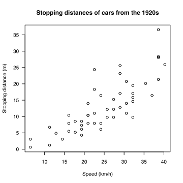
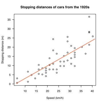
Here's another example. Two data sets relating the stopping distances and speed of 1920s cars have been plotted on a scatter plot:
Interpolation and Extrapolation
In interpolation, we look for a missing value that lies in the range of our data set. For example, I have used linear interpolation
(using a line to estimate the value) on the scatter plot below
to estimate the number of bowls of soup sold when the temperature is \(9 {}^\circ \text{C}\.)

In extrapolation, we look for a missing value that lies outside the range of our data set. We perform linear extrapolation by extending the
line of best fit to include the data values we are looking for. On the scatter plot below, I've used linear extrapolation to estimate the number of bowls of soup
sold when the temperature reaches \(22.5 {}^\circ \text{C}\).
Note: these techniques can only give an estimate of the missing values. Extrapolation, in particular, can give misleading results as we really can't be certain about what happens to our data values once we leave our data set.
Using an Equation to Interpolate or Extrapolate
We can use the points on our scatter plot to come up with an approximate equation for the line of best fit. We can then use the equation of this line to extrapolate or interpolate.
Let's try it on our soup example. We only need two points to find the equation of a straight line. Choose two that are as close to the line of best fit as possible.
I've chosen the points \((15^\circ,18)\) and \((17^\circ, 15)\), corresponding to the orange circle and blue square on my scatter plot.
First, let's find the gradient (slope) of the line:
Interpolating
We want to predict the number of bowls of soup that will be sold when the temperature is \(9^\circ\), so we plug this \(x\)-value into the above equation to give
Extrapolating
If we want to predict the number of bowls of soup that will be sold when the temperature is \(22.5^\circ\), then we need to extrapolate because this value is outside the range of our temperature data set. Plug \(x = 22.5\) into the equation to give
You need to be very careful not to extrapolate too far. If you tried to use the equation to predict how many bowls of soup would be sold at a temperature of \(40^\circ\), you'd get
Correlation
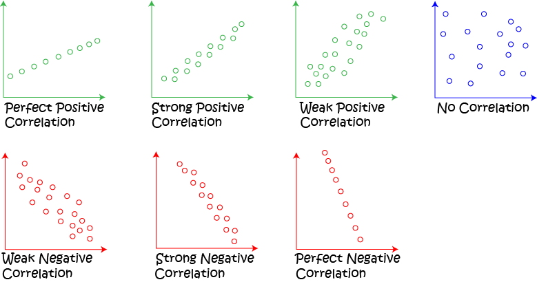
Correlation gives us a measure of how strongly linked two sets of data are.
We say that the correlation is positive if both sets of data values increase together.
If one set of data values increases while the other decreases, then we say that the correlation is negative.
The values of linear correlation lie between \(-1\) and \(1\).
Examples
There is a positive correlation between the stopping distances of 1920s cars and their speed:
There is a negative correlation between soup sales and the temperature:
Description
In these chapters you will learn more about
- Histograms
- Scatter plots
- Stem and leaf plots etc
these lessons are for students studying maths in Year 10 or highter
Audience
Year 10 students or higher, however, suitable for Year 8+ students too.
Learning Objectives
Learn about plotting
Author: Subject Coach
Added on: 28th Sep 2018
You must be logged in as Student to ask a Question.
None just yet!