Prekinder to Grade 2 Mathematics
Bar Charts
Bar Charts
Bar charts, which are also called bar graphs, provide you with a nice visual way to display data. A bar chart is made up of columns of different heights. Each column
represents data in a different category. The heights of the columns tell you how many different people or objects are in each category. Bar charts give a really quick way of telling which category is the most popular,
which category is the least popular, and which categories are more popular than which other categories. They are really useful for displaying the relative sizes of many different types of things.
Let's have a look at some examples of bar charts.
Gus the Snail's Feral Caterpillar Problem
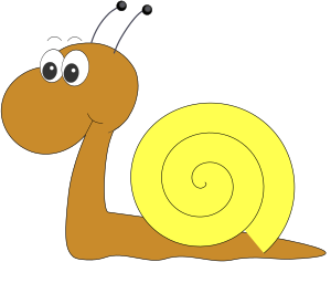
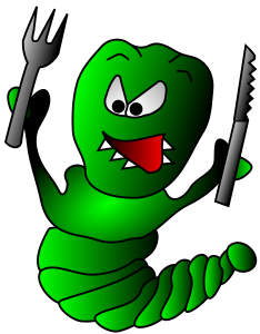
Do you remember our old friend, Gus the snail? Gus is still dealing with a feral caterpillar problem. Caterpillars keep eating all of the vegetables in his garden. Gus decides that the best way to tackle the problem is to do a survey to find out which vegetables the caterpillars like least, and then plant those. He interviews the caterpillars and then displays the results on a bar chart so that he can see, at a glance, which vegetables are most popular with the caterpillars (so he shouldn't plant them) and which vegetables are least popular with the caterpillars (so he should plant them).
Here are the results of Gus' survey:
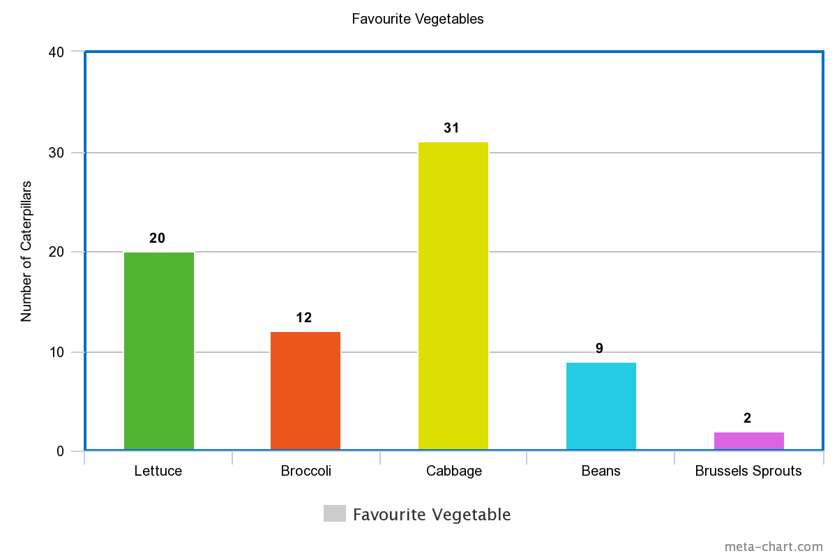
It is easy to see from the bar chart that cabbage is the most popular vegetable for the caterpillars. \(31\) of them like cabbage the best. Gus definitely shouldn't plant cabbage in his garden. We can also easily see that the least popular vegetable is Brussels Sprouts. Only \(2\) caterpillars like them. So, Gus' results suggest that he should plant Brussels Sprouts. However, there's a problem. Gus doesn't like Brussels Sprouts much either. Do you?
Maybe Gus should go with the second least popular vegetable, which is beans. Only \(9\) caterpillars like beans. Does that sound like a good idea, Gus?
Gus could also have drawn his bar chart horizontally, like this:
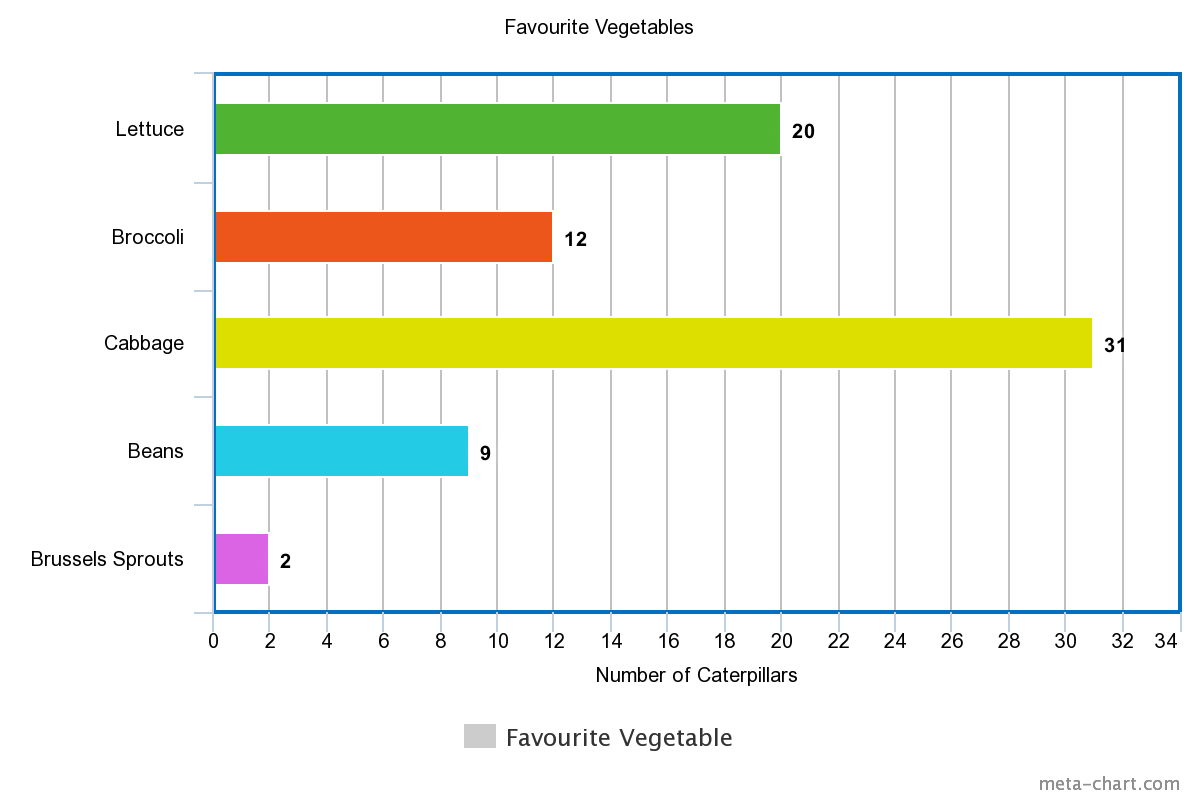
It still shows the same data, and it's just as easy to tell which vegetable was most popular and which vegetable was least popular with the caterpillars. It's just a matter of choosing the one you think looks better.
Alice and the Movies

It looks like Alice the cow has caught the survey bug, too. She's decided to survey the other cows in her field to find out which horror movie they think is the scariest. Once she has collected her data, she draws a bar chart and uses it to decide which movie she should see next.
Here's Alice's bar chart. These look like some pretty scary movies...
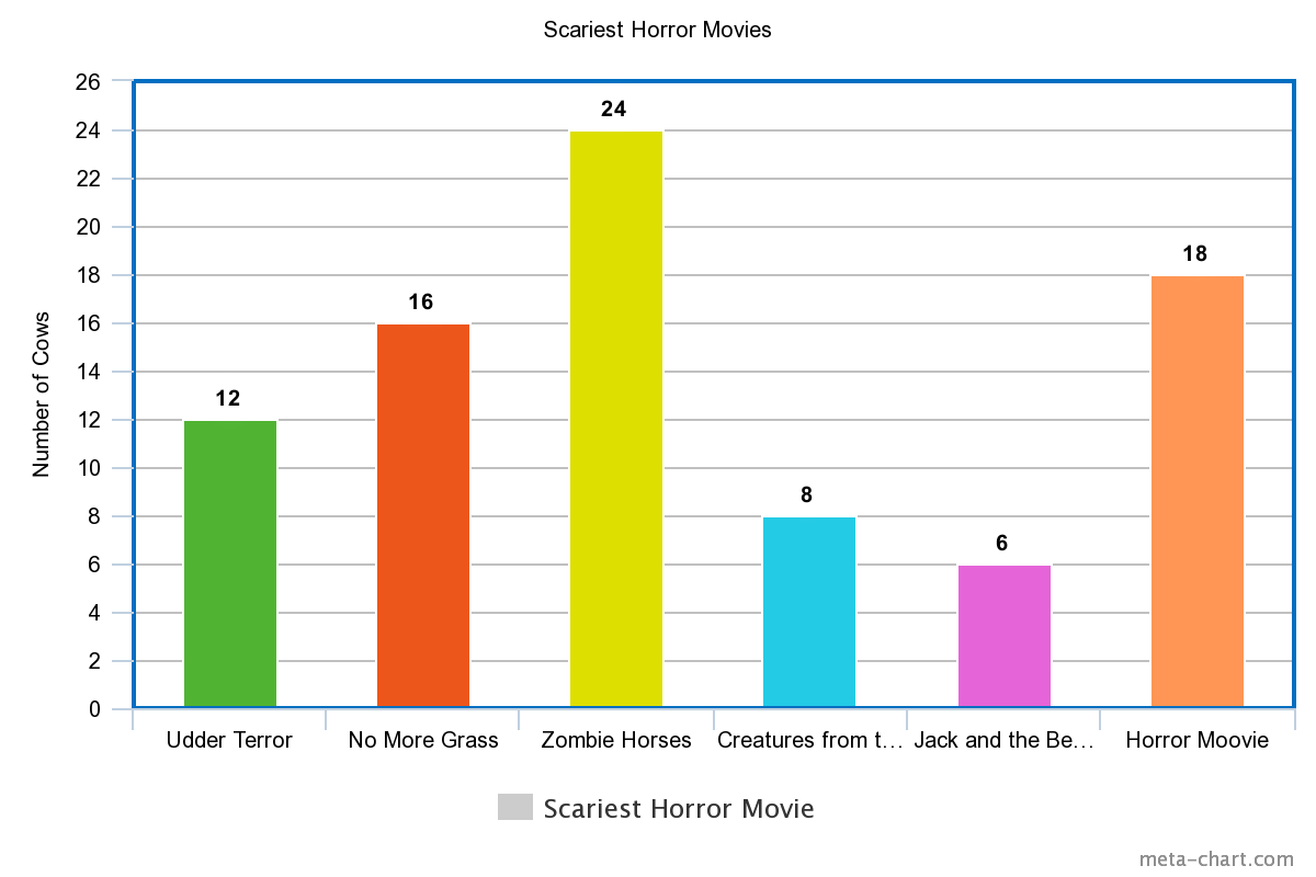
Well, it looks like the scariest movie is "Zombie Horses", with \(24\) votes. It isn't a pleasant thought, is it? Next comes the aptly named "Horror Moovie", with \(18\) votes, followed by "No More Grass", with \(16\) votes. I can see why that one would scare a cow. "Udder Terror" follows with \(12\) votes, "Creatures from the Dam" is next, with \(8\) votes, and the least scary movie is "Jack and the Beanstalk", with \(6\) votes. I can see why a cow would find that one scary - Jack sells his cow for beans, after all.
So, which movie should Alice watch? It depends if she's trying to curdle her milk or not. If she really wants a fright, she should choose "Zombie Horses", but if she'd prefer to keep her milk sweet, she'd be best off choosing "Jack and the Beanstalk".
Penguin Watching in Port Stephens
Sam and Al have decided to keep track of the penguins they spot in Port Stephens during their monthly visits for the six months from January through until June. They think that a bar chart would a good choice as it will let them easily work out the months in which the penguin population is highest. They record their data and draw the bar chart shown below:
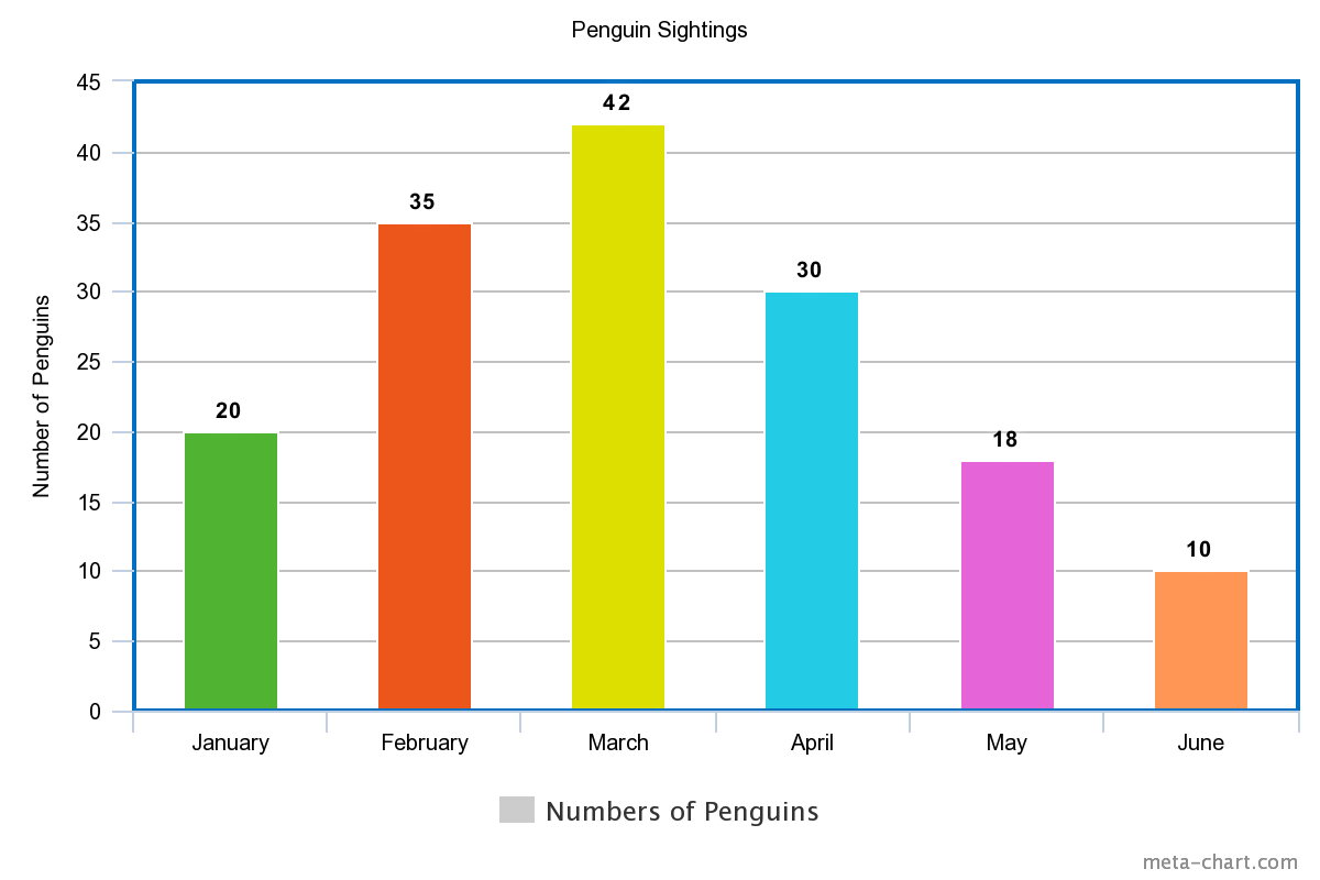
It looks like penguins were most commonly seen in March, with a total of \(42\) penguin sightings during that visit. Their numbers appear to be smallest in June, when there were only \(10\) sightings, and the column in the bar chart is the lowest.
Histograms and Bar Charts
At first glance, histograms and bar charts appear to be the same thing. However, there are differences. If you look at the two examples below, you'll notice that there are gaps between the columns of a bar chart, and no gaps between the columns of a histogram.
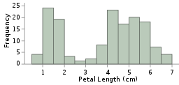
Histograms, like the one on the left, are useful for displaying continuous data, like the lengths of Iris petals, or the heights of people.
Bar charts, like the one on the right, are useful for displaying data that can be grouped into different categories such as months, different types of vegetables, or titles of horror movies.
Conclusion
Why don't you have a go at conducting some surveys, tabulating your results and using them to draw bar charts? It's lots of fun, and you never know what you might find out.
Description
This mini book covers the core of Math for Foundation, Grade 1 and Grade 2 mathematics including
- Numbers
- Addition
- Subtraction
- Division
- Algebra
- Geometry
- Data
- Estimation
- Probability/Chance
- Measurement
- Time
- Money
- and much more
This material is provided free of cost for Parent looking for some tricks for their Prekinder, Kinder, Prep, Year 1 and Year 2 children
Audience
Grade 1/Year 1, Grade 2/Year 2, Prep, Foundation, Kinder and Pre-Kinder
Learning Objectives
These lessons are for kids aged 4-8 with the core objective to expose their brains to concepts of addition, subtraction, division, algebra and much more.
Author: Subject Coach
Added on: 6th Apr 2018
You must be logged in as Student to ask a Question.
None just yet!