Prekinder to Grade 2 Mathematics
Displaying the Results from a Survey
Displaying the Results from a Survey
There's not much point in conducting a survey if you aren't going to tell anyone about your results. This article contains suggestions for some good ways to display the results from your survey. Always remember that the choices you make depend on the data you have and the conclusions you want to draw from your data.
Tables
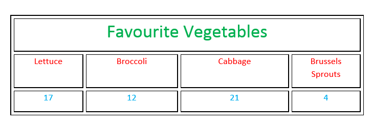
If your survey is very simple, you might be able to use a table to display your data. Tables provide a simple way of showing people your results. Don't forget to give your table a title so that people looking at it will understand what your survey was about.
Statistics
Statistics like the mean, maximum and minimum values, and standard deviation can be used to give you a summary of the results from survey.
For example, if you survey the people in your class to find out how old they are, it might be more meaningful to report a summary like this, rather than a list of exact ages:
- Youngest Person: \(7\) years
- Oldest Person: \(9\) years
- Average Age: \(8.2\) years
Graphs
Graphs provide a useful way to summarise your data. They can make it easy to see the relative sizes of different categories, or they can highlight trends in your data.
Here are some of the graphs that you might use to display your data:
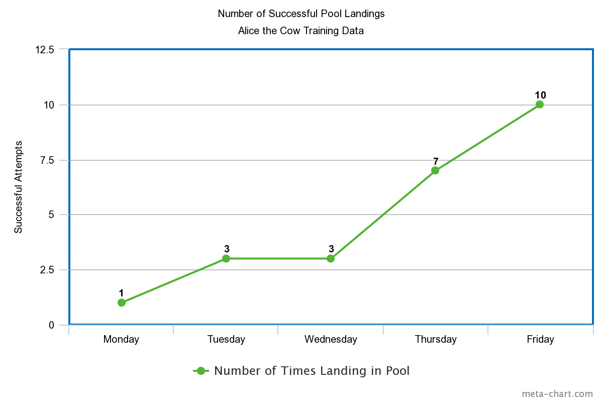
A line graph shows you information that is connected somehow. For example, you might use a line graph to show how something has increased, decreased or stayed the same over time.
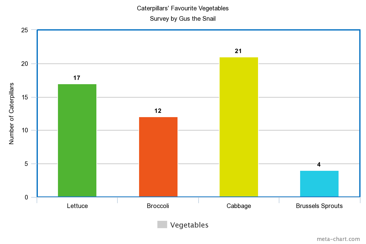
A bar chart is useful when you want to be able to work out how the sizes of different categories compare to each other. Perhaps you want to be able to quickly identify which one of a collection of categories is most popular, and which one is least popular.

A pie chart is useful when you want to find what proportion of the entire population each category makes up. Pie charts are often labelled with the percentages of the population that falls into each category.
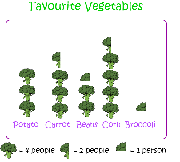
Pictographs provide a fun and interesting way of presenting data. A pictograph should include a key telling you what each picture stands for. Pictographs may not be very accurate, but they are useful for quickly showing you the relative sizes of each category.
Reporting People's Comments
Sometimes surveys include questions that give people the opportunity to state their opinions of something, or to comment on something that is relevant to the survey. If your survey does this, you can report the more interesting comments made by people. You might like to arrange them in a table.
For example, you might say:
"In response to the question "Why don't you like brussels sprouts?", we received the following interesting replies:"
- "Because they don't mix well with honey."
- "Because my dog refuses to eat them."
Writing a Report
Finally, you should write a report that talks about what you have found out, any conclusions you have drawn, and what action you are likely to take as a result of your survey.
Description
This mini book covers the core of Math for Foundation, Grade 1 and Grade 2 mathematics including
- Numbers
- Addition
- Subtraction
- Division
- Algebra
- Geometry
- Data
- Estimation
- Probability/Chance
- Measurement
- Time
- Money
- and much more
This material is provided free of cost for Parent looking for some tricks for their Prekinder, Kinder, Prep, Year 1 and Year 2 children
Audience
Grade 1/Year 1, Grade 2/Year 2, Prep, Foundation, Kinder and Pre-Kinder
Learning Objectives
These lessons are for kids aged 4-8 with the core objective to expose their brains to concepts of addition, subtraction, division, algebra and much more.
Author: Subject Coach
Added on: 6th Apr 2018
You must be logged in as Student to ask a Question.
None just yet!